Guide
The nine colors, one by one
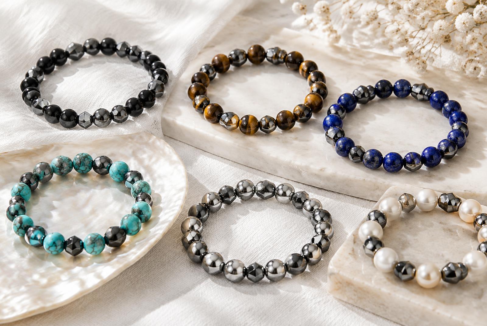
Every bracelet in the collection shares the same base: two rows of black hematite, rectangular and round beads alternating. What changes is the accent stone — and each one has its own character, history and best pairing.
Turquoise
One of the oldest stones in human ornament, mined in Sinai and Persia thousands of years ago and traded across half the world. Its opaque sky-blue is the highest-contrast partner black hematite has — the pairing looks brightest in summer light and against denim. Traditionally it was a traveller's stone, carried for safe passage.
Tiger eye
A quartz with fibrous bands that shift as the bracelet moves, an effect jewellers call chatoyancy — literally 'cat's eye'. Warm gold and brown against gunmetal makes this the most autumnal of the nine, and the only one that visibly changes as you turn your wrist. Long associated in folklore with steadiness and clear sight.
Silver
The quietest option: bright metallic beads against the darker mirror of hematite, so the whole bracelet reads as one tonal family. It disappears politely under a shirt cuff, which is exactly why people who say they do not wear jewelry tend to choose this one first.
Pearl
Soft cream against hard black — the strongest texture contrast in the collection, matte warmth beside a cool mirror. Pearls have carried associations with composure and clarity in nearly every culture that harvested them, and the pale beads soften hematite's industrial edge more than any other color here.
Lapis
Deep, saturated ultramarine, sometimes flecked with gold-colored pyrite. Lapis was ground into the most expensive pigment in medieval painting and set into Egyptian burial ornament long before that. Against black it is the most regal of the nine, and the least casual.
Jade
Green, dense and smooth, with a slightly waxy lustre that catches light differently from the glassy stones. Jade has been the most culturally weighted stone in East Asia for millennia, valued above gold and associated with virtue and longevity. The green reads as calm rather than bright.
Blue
A clearer, cooler blue than lapis — brighter, more open, more everyday. This is the easy-wearing color: strong enough to notice, neutral enough for work, and the most natural partner to a white shirt or anything grey.
Black
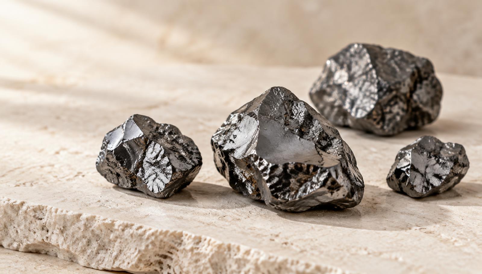
All hematite, no accent: two rows of gunmetal mirror and nothing else. It is the most versatile piece in the collection and the one most people wear daily, because it behaves like a watch strap — present, never competing with anything.
Amethyst
Purple quartz, historically so prized that it sat among the cardinal gems until vast Brazilian deposits made it widely available. Against black it is the deepest, moodiest color of the nine. Its old Greek name refers to clear-headedness at a banquet, which is why it turns up so often in stories about temperance.
Why black works with all of them
Hematite is achromatic — it has no hue of its own, only value. That is why it never clashes: it acts as an outline around whatever color sits next to it, the same way a dark frame makes a painting read more clearly. Pair the same turquoise bead with brown wood and it looks rustic; pair it with black hematite and it looks graphic.
The practical upshot is that you can own several of these and none of them will fight each other on the same wrist.
MagBrace makes no health or medical claims of any kind. These bracelets are jewelry — worn for how they look and feel, nothing more.
How copper changes the palette
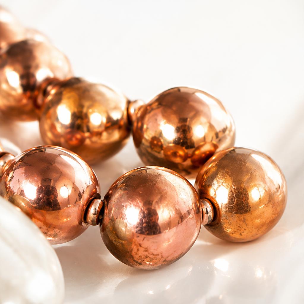
Copper gives the nine-color palette a warmer reference point. Turquoise and lapis appear brighter beside reddish metal, while tiger eye and copper form a quieter tonal combination. Pearl creates the strongest light-dark contrast, and black hematite keeps the overall effect grounded. This is why the same accent stone can feel crisp beside silver-tone beads but earthy beside copper.
The copper surface changes too. Freshly polished metal can look pink-orange; a brushed finish softens toward warm gold; natural patina brings deeper bronze and brown. Those shifts are part of the material rather than a printed color. When choosing a combination, think about the finish as well as the stone. High shine feels dressier, hammered copper adds texture, and aged copper gives colorful beads a more relaxed, vintage setting.